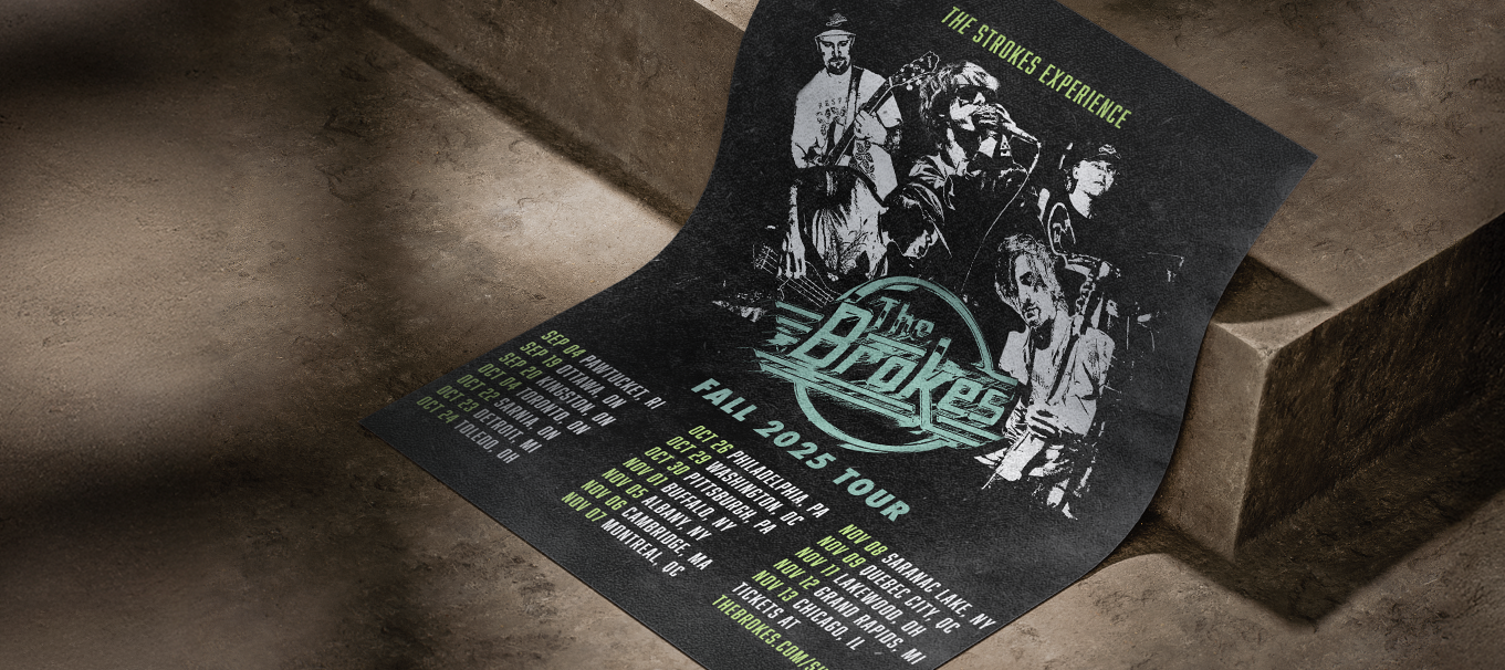
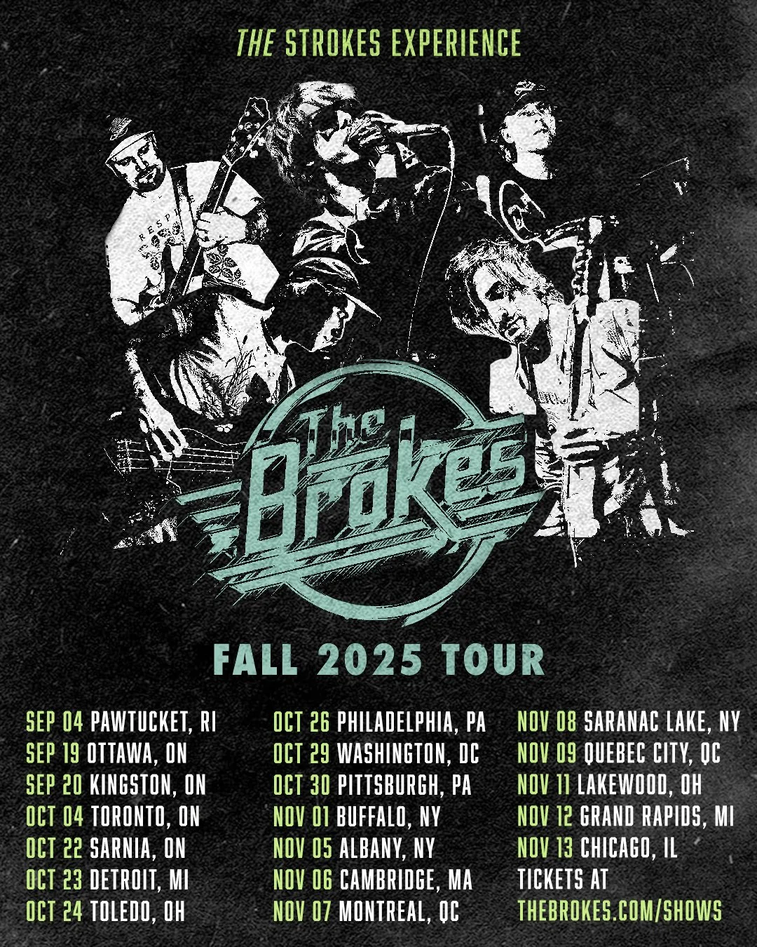
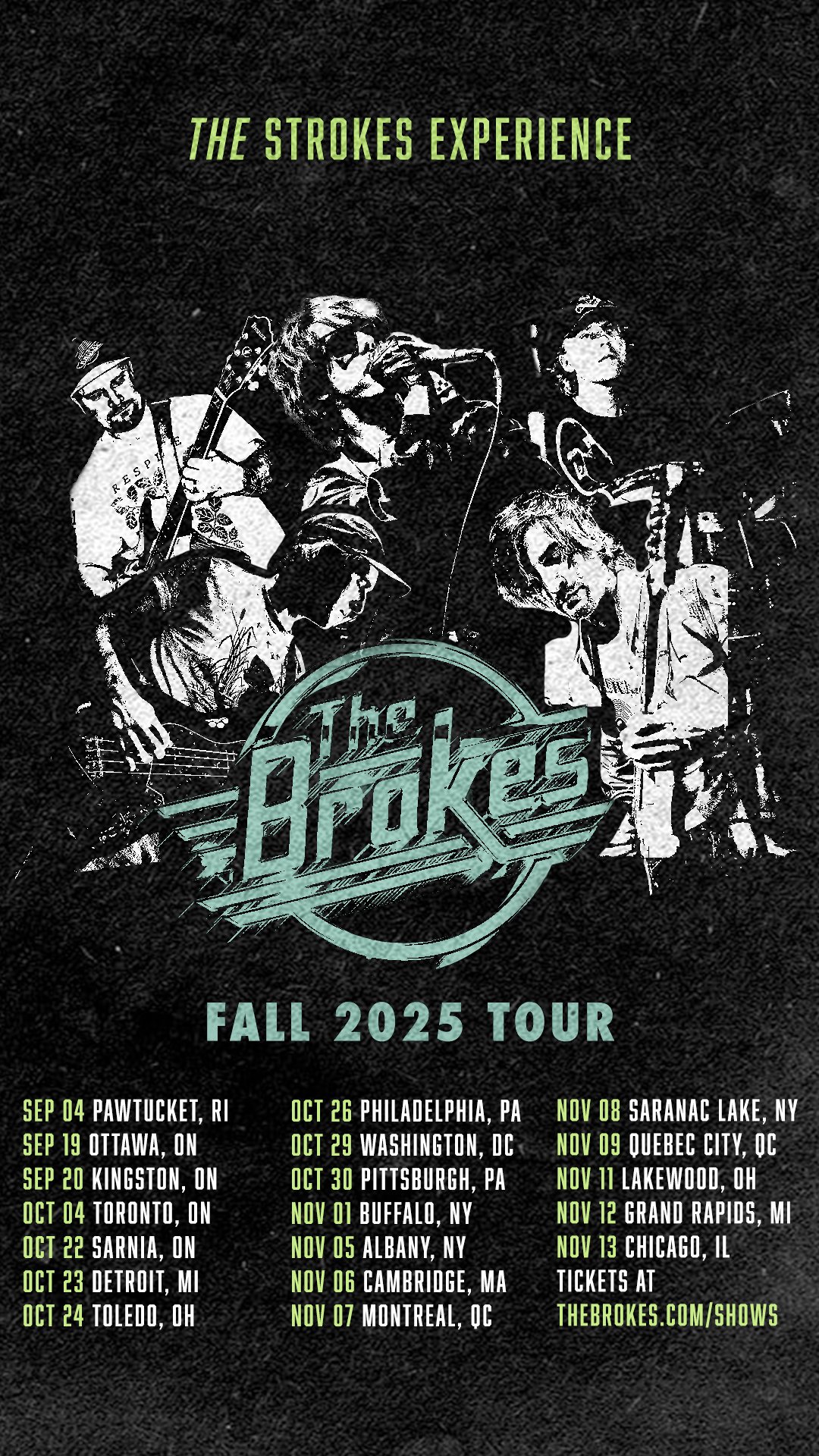
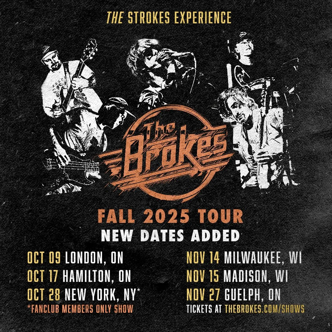
The Brokes Tour Identity
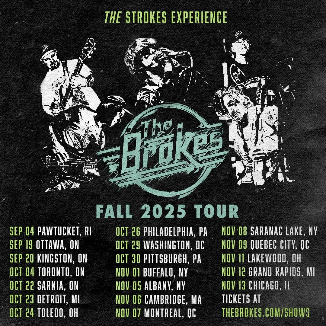
Tour branding and campaign for a 26-date U.S. and Canadian run of the critically acclaimed The Strokes tribute band
Role: Poster design, visual identity, typography, image retouching, social assets
Project Overview
The visual system is rooted in 2000s indie sleaze and grunge aesthetics, combining distressed textures, bright and bold typography, and high-impact photo treatments. I created a main tour poster, multi-ratio social media versions, and individual assets for each venue to utilize. All venues were supplied a visual identity guide for proper usage of fonts, colors, and tour assets.
Execution
Designed a primary tour poster and flexible layout system for multiple formats
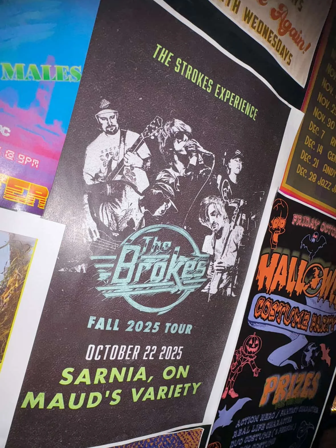
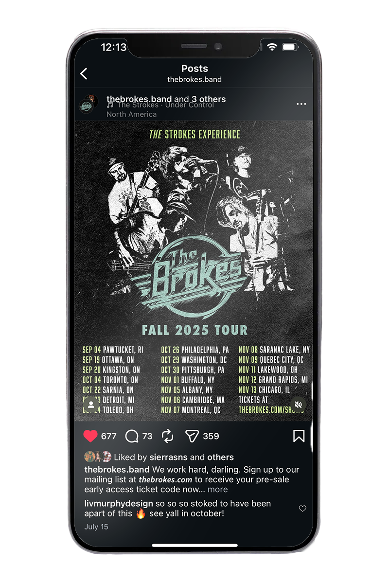
Created social media assets and venue-specific variations for all 26 stops
Retouched and stylized concert photography to unify the visual tone
Developed a cohesive color and typography system for consistent use across platforms
Delivered a visual identity guide for venues to apply assets correctly
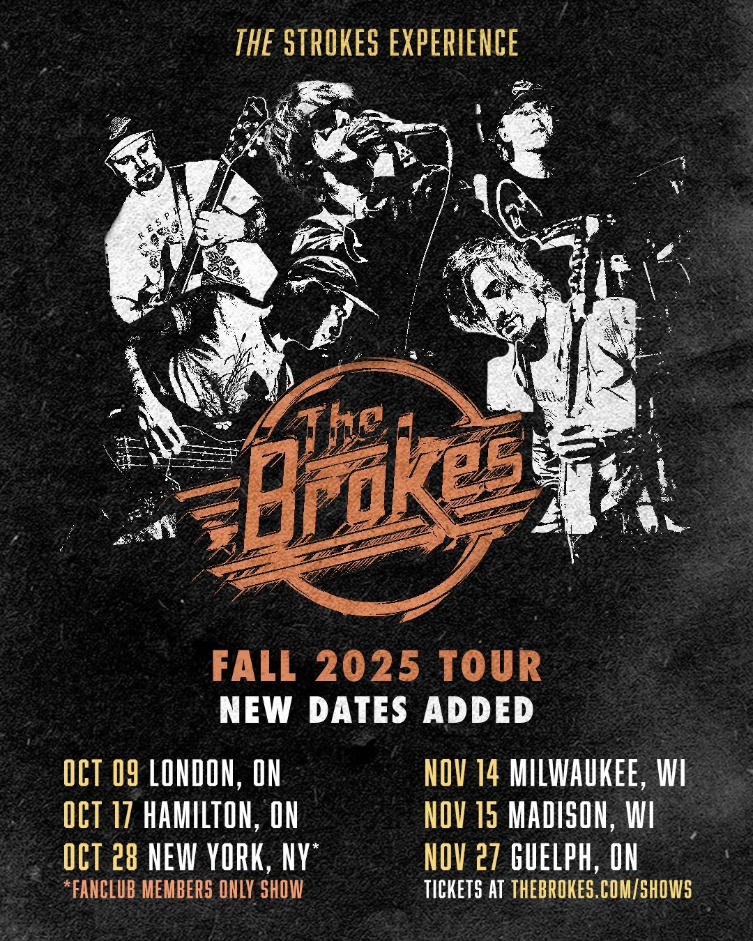
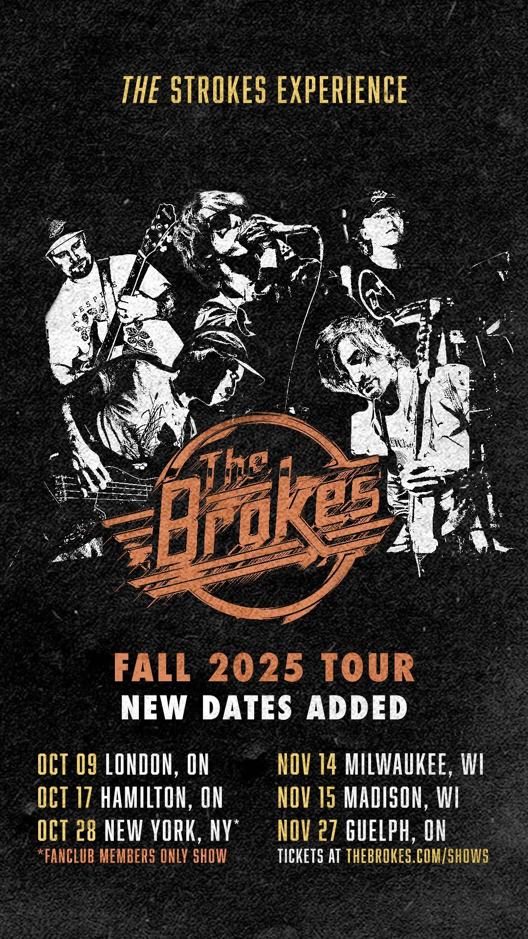
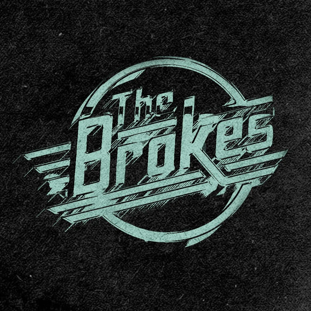
Expanded the system for additional tour dates and alternate colorways
Alternate color way for additional dates
Marlon Chaplin of The Brokes
“I found Liv to not only display a stunning penchant for pro-activity in her work, but a wonderful and imaginative creative voice while able to take and adhere to notes in a professional and productive manner. Her professionalism is everything a client looks for in a graphic artist. Punctuality, a keen and collaborative ear and an organized workflow. Anybody would be wise to choose Liv for their next project.”
The Outcome
The tour was highly successful, with strong attendance across all 26 dates and widespread use of the posters by venues both online and in print. The main tour announcement post performed especially well, reaching 43,580 views and generating 1,158 interactions, including 677 likes, 73 comments, and 359 shares. The cohesive identity I created through these designs helped amplify excitement and visibility for the tour.